Designing a cultural interface for a creative service business
Product-minded website case study
thumbnail.png)
Overview
Easyplate is a studio brand that brings together two fundamentally different services under one identity.

A cultural event and production service with proven results and revenue
An upcoming digital product focused on travel curation and booking
The challenge was not simply to present both services, but to communicate how they coexist meaningfully within a single brand.
Problem Definition
To unify these services, the website needed to function as more than an informational channel. It had to act as a cultural interface one that conveys brand values, attitude, and trust at a glance.
Traditional service websites rely heavily on explanation. While informative, they often fail to communicate credibility and identity intuitively.
How can a website express trust and professionalism without requiring users to read through complex explanations?
Strategy
The website was designed to let users feel the brand before understanding the service
strategy.png)
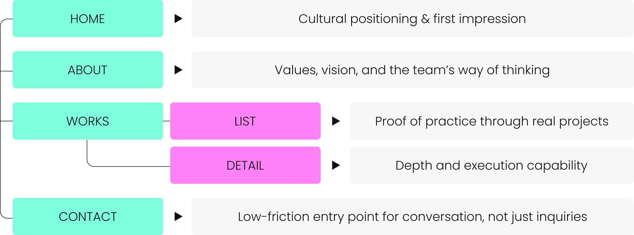
IA & Page roles
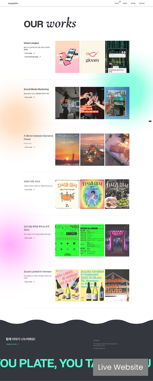
The structure was designed to gradually move users from emotional impression to practical trust, aligning brand perception with service credibility.
UX & Visual Strategy
This concept became the foundation of the overall experience design. Rather than prioritizing conventional UX rules, the site was designed to reflect Easyplate’s brand philosophy allowing users to experience the mindset instead of reading about it.
slogan.png)
to create visual rhythm and express brand personality
that favors impression over detailed reading
guiding users through differentiated visual moments rather than uniform patterns
Motion and color transitions were used as primary tools to communicate tone and rhythm, rather than decorative effects.
The design system was intentionally kept minimal to support flexibility across diverse content types.
design%20system.png)
Outcome & Reflection
The website currently functions as a living product that supports Easyplate’s ongoing service business and acts as a primary trust-building touchpoint.
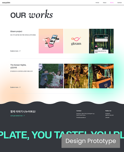
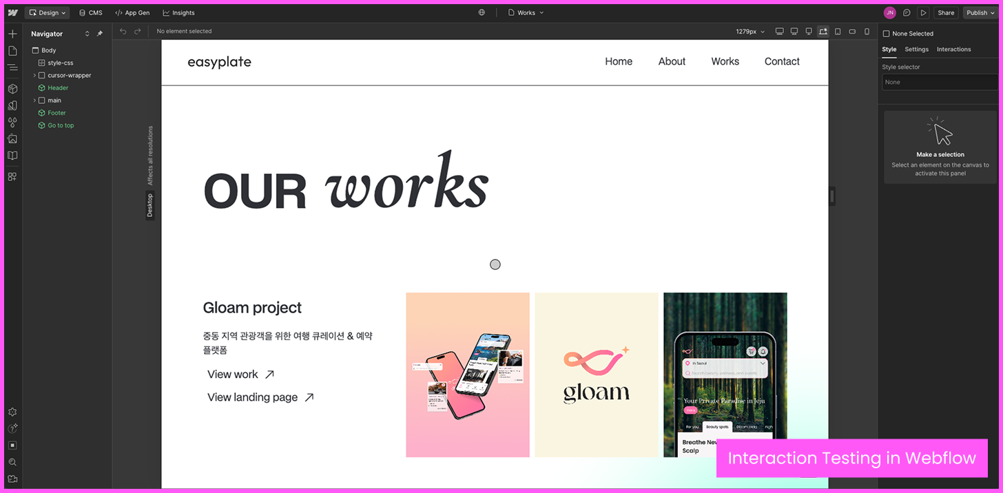
Designed and implemented by me in Webflow, the experience was iteratively tested and refined directly in production rather than through static prototypes.


What this project shows about me
This project demonstrates my approach to product design beyond apps designing structured, intentional web experiences that balance business goals, brand identity, and user perception
-especially in contexts where brand, culture, and business are tightly connected.