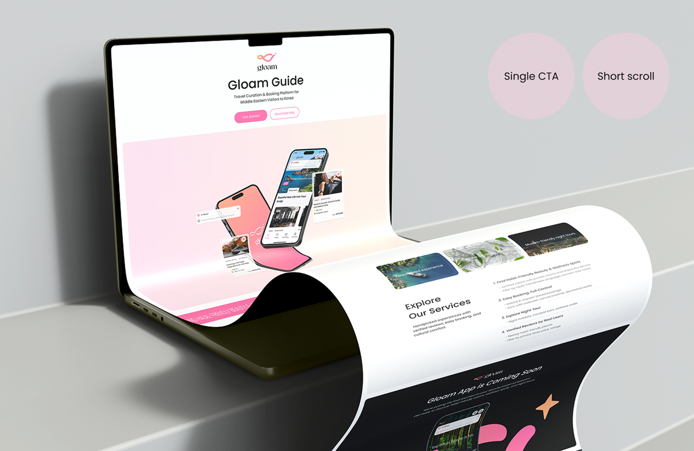
Product-Led Landing Page for Niche Validation
• Landing page visits increased 3x compared to the usual baseline during the roadshow period
• Achieved an average CTR of 10.7% from organic search traffic
• Led planning, design, and development
Overview
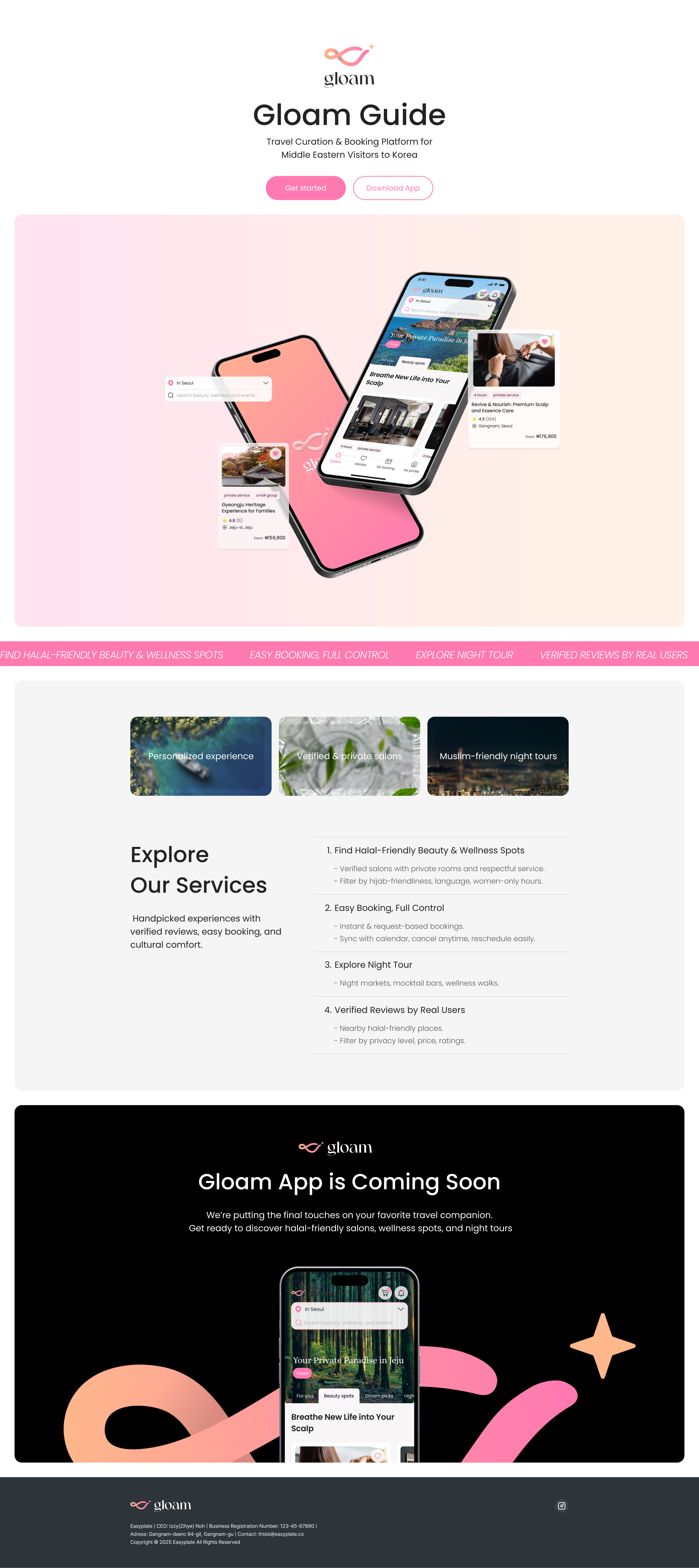
This project explores how a highly focused niche strategy can shape a product’s first touchpoint. Instead of building a full marketing website, I intentionally designed a focused landing page to rapidly validate cultural relevance and convert a niche audience with minimal build.

The Strategic Decision
Rather than building a generic homepage, I prioritized cultural specificity not just as a visual touchpoint, but as a trust trigger, shortening the path from awareness to action.
Product Framing
This page is:
→ Designed to be the first controlled touchpoint where users quickly understand who the product is for and why it exists, before entering the app.
→ Focused on reducing explanation overhead and communicating a single, culturally specific value proposition without feature overload.
→ Built to move users directly into the app, where trust, privacy, and usability are experienced rather than explained.
This page is not:
→ Feature discovery is intentionally deferred to the app to avoid premature complexity and cognitive fatigue.
→ Long-form narratives and visual branding were deprioritized in favor of immediate relevance and comprehension.
→ The page avoids multiple CTAs, lead capture, or persuasive tactics, prioritizing a calm and respectful entry into the product.
UX Decisions
• Kept the page intentionally short to reduce cognitive load
• Prioritized emotional reassurance over feature explanations
• Used a single CTA to avoid decision friction
OAnticipated low patience for long-form content, so I minimized cognitive load by keeping copy sparse and action obvious.


Execution Approach


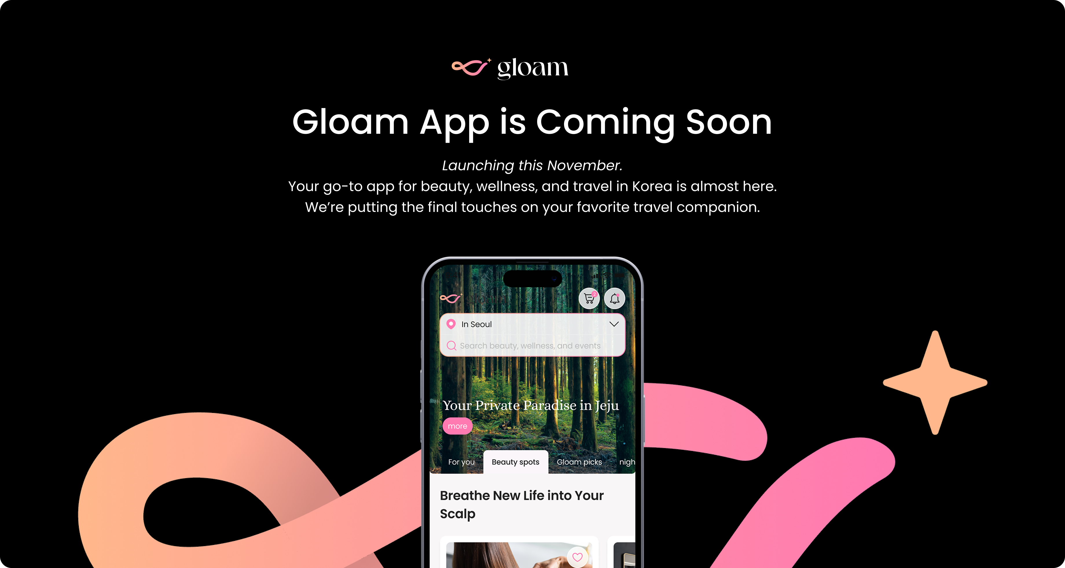
The download CTA led to no action, creating a dead-end experience that risked breaking user trust.

CTA interaction was redesigned to guide users to a “Coming Soon” state instead of creating a dead-end.

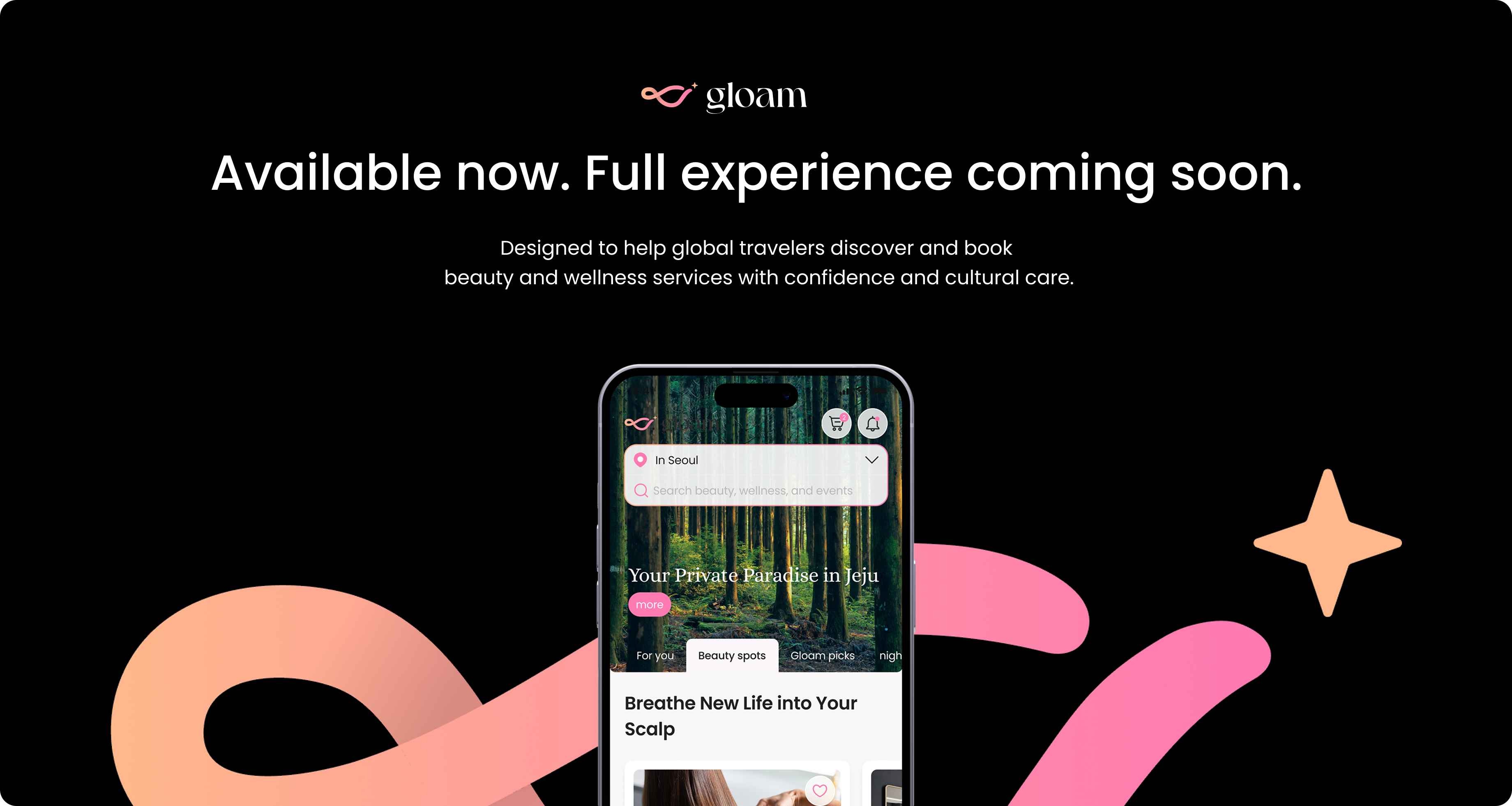
Once the app became available, the CTA was connected to the App Store, while the lower section continued to set expectations around features still in preparation.
Designed, built, and deployed a functional landing page to validate core hypotheses with real users.
Adjusted messaging and interaction details on the same day based on on-site user reactions during the Abu Dhabi roadshow.
Built and shipped independently using Webflow, enabling fast iteration without collaboration bottlenecks.
Reflection
This project demonstrates my approach to product design:
using focus, restraint, and strategic clarity to design interfaces that serve a specific business and user goal.
This work functions as a strategic prototype, with user interaction informing ongoing iteration toward sharper conversion.
Although traffic metrics weren’t tracked, this page was built as a strategic prototype to validate UX hypotheses around culturally specific onboarding and value positioning.