A Public Sector UX Improvement Focused on Accessibility and Trust
koFONS Web UI/UX Renewal
Accessible Public Platform Renewal with Sustained Performance Recognition
• Achieved “Excellent Institution” status for two consecutive years in the public institution customer satisfaction survey following the renewal
• Maintained annual WCAG 2.1 web accessibility certification since 2020
Overview
This project involved the renewal of a public sector website, carried out under clearly defined requirements and strict constraints around accessibility and long-term operation.
While I was not the main project owner, I was responsible for UX/UI design and publishing for several key sections. I supported the final implementation by applying an existing design and code board system to real production screens.
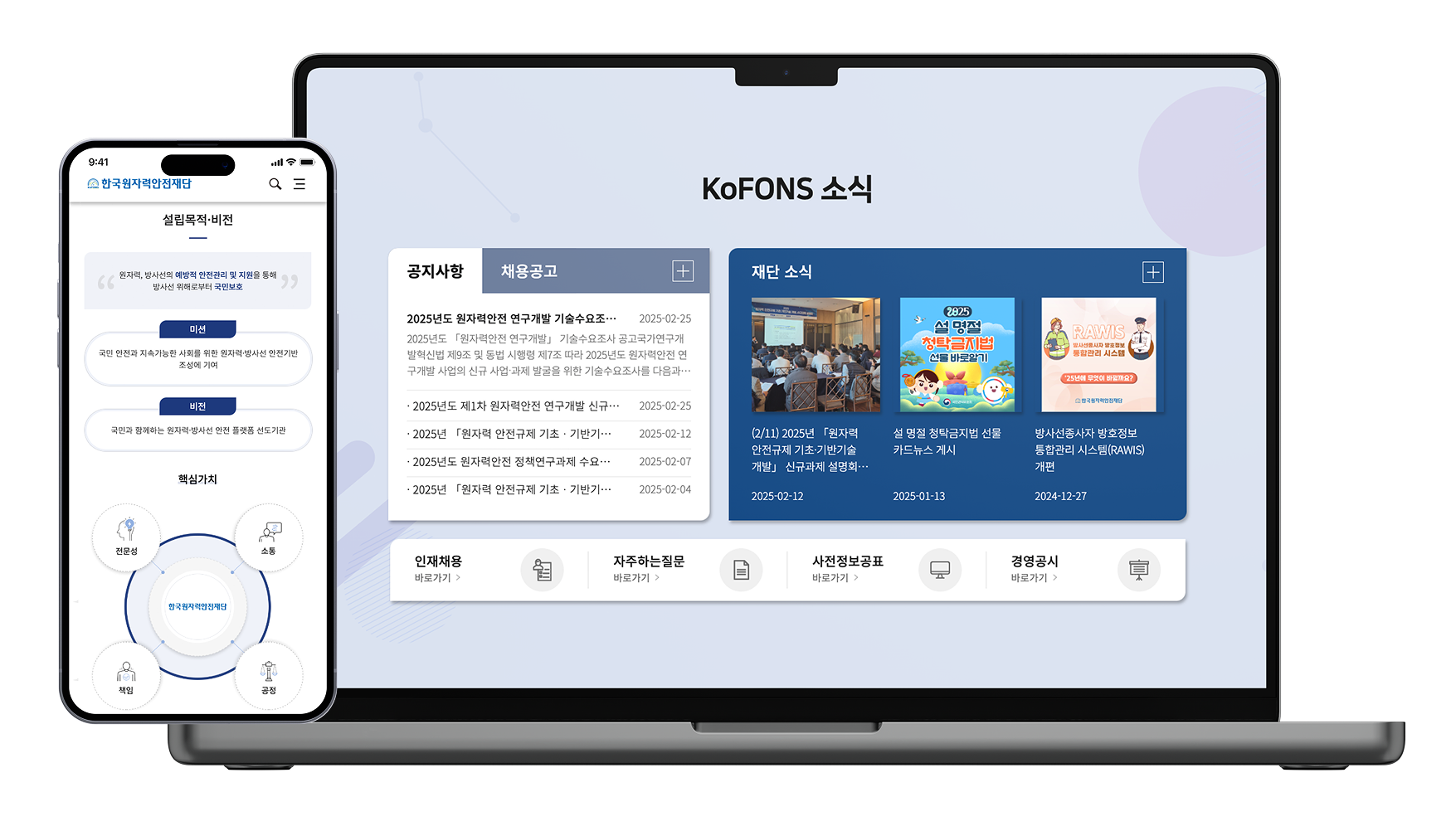
overview.png)
Context
The existing KOFONS website was primarily structured around information delivery, which resulted in several usability issues:
• Users struggled to find relevant information efficiently
• Page structures were not clearly organized by task or purpose
Given the nature of public sector services, the core challenge was not visual refinement alone,but rethinking how information and user experience were structured and delivered.
Problem Space
As a result, users spent unnecessary time navigating before reaching the information they needed.
My Role
• UX/UI design for selected key pages and sections
• Screen composition using an existing design and code board system
• Publishing support and alignment between design and implementation
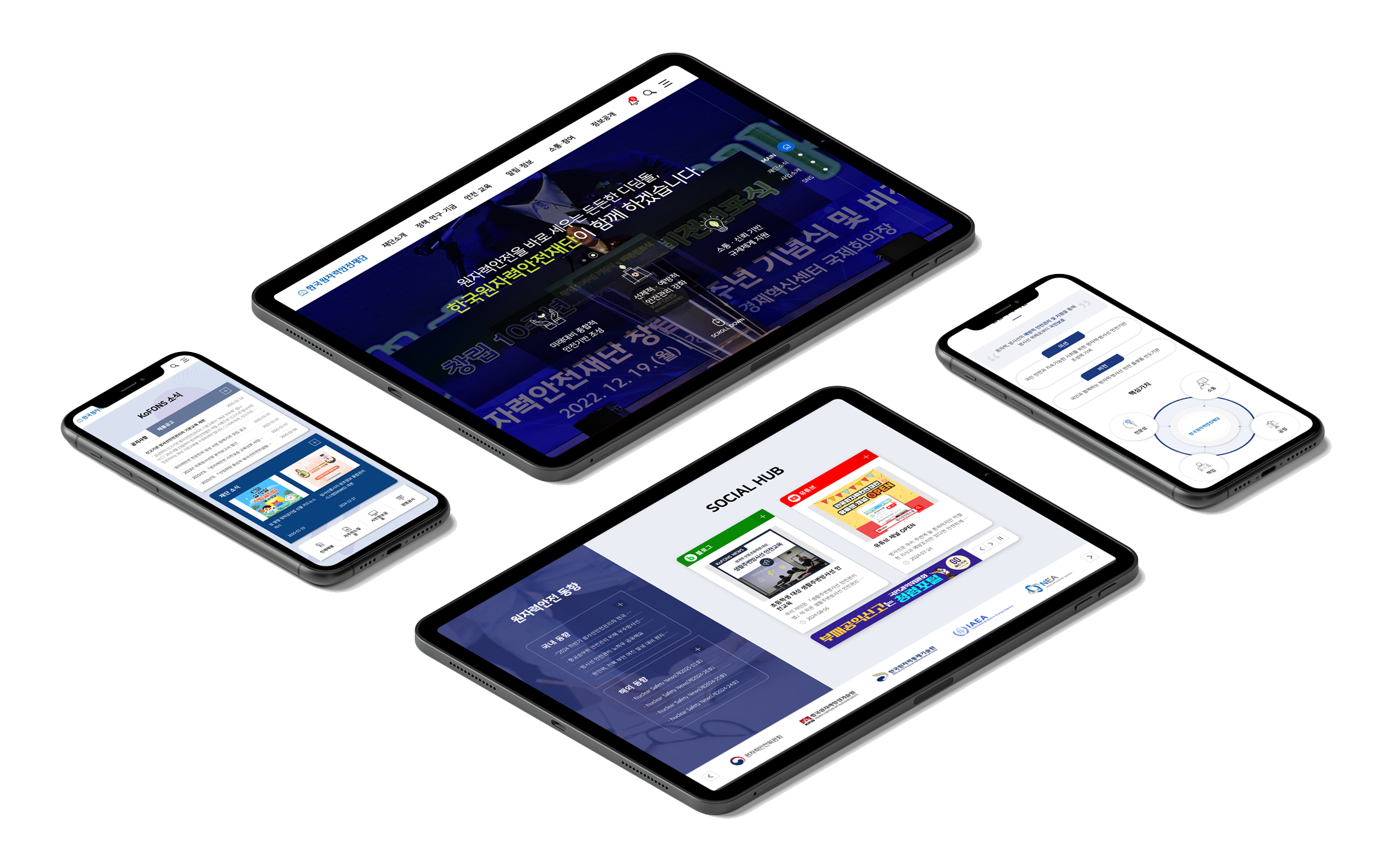
myrole-img1.png)
myrole-img2.png)
Approach
1) From information delivery to user-centered structure
• Improved content readability and navigation through GNB redesign
• Reorganized menus based on user actions rather than organizational structure
approach1.png)
approach1-m.png)
2) Practical application of board-based design
Prepared design templates and HTML markup were applied and adjusted to actual screen layouts.
This allowed the team to maintain visual consistency while quickly accommodating the large content volume and accessibility requirements typical of public institutions.
approach2.png)
2) UX refinement through publishing
I handled publishing directly, ensuring that design guidelines translated accurately into real browser environments by following web standards. Rather than treating responsive layouts as simple scaling, I designed breakpoint-specific layouts based on how users consume information across devices.

Accessibility ((WCAG 2.1)
I was responsible for implementing accessibility compliance throughout both design and publishing phases.
Through repeated testing and iteration, the project ultimately met official accessibility certification standards.
accessibility1.png)
accessibility1-m.png)
Support for color vision deficiency and low vision
accessibility2.png)
accessibility2-m.png)
Support for users with limited motor control
accessibility3.png)
accessibility3-m.png)
Support for users with cognitive or learning difficulties
Outcome
• Achieved “Excellent Institution” rating in public sector customer satisfaction surveys for two consecutive years after the redesign
outcome.png)
• UI and publishing fully aligned with WCAG 2.1 standards
outcome2.png)
Recognized as an accessible and user-friendly website for elderly users and people with disabilities
Reflection
This project reinforced the importance of user-centered UX design in public service environments.
By working across information architecture, design, and publishing, I gained a deeper understanding of how usability, accessibility, and implementation must align to create meaningful and inclusive user experiences.